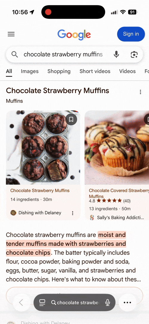
Google is testing a new, more publisher-friendly version of the AI Overviews for recipe results. The new design has the recipe cards at the top, citations at the bottom and a shorter AI response.
These should be able to generated a higher click-through rate to the publishers site, over the current method.
This update was spotted by Inspired Taste on X who wrote:
Meanwhile in the world of AIOs. This is much better Google. Instead of an untested AI Frankenstein recipe as the default response there is a basic recipe overview and rich result links. Credit where it’s due.
I was able to replicate this, here is a GIF of it in action:
Here is the video:
Meanwhile in the world of AIOs. This is much better Google. Instead of an untested AI Frankenstein recipe as the default response there is a basic recipe overview and rich result links. Credit where it’s due. cc @glenngabe @rustybrick pic.twitter.com/rIuaKYAY6U
— Inspired Taste (@inspiredtaste) October 4, 2025
Here is the old/current one:
If inaccuracy and full AI Frankenstein recipes wasn’t bad enough now when we click the recipe citations (which many users won’t) it jumps to content on the page with this horrible yellow highlight. Has any engineer actually tried using this UX!? pic.twitter.com/pKM9zwxqgr
— Inspired Taste (@inspiredtaste) March 11, 2025
Here is another:
Yes, the AIO is just an overview and there are recipe card links without a full recipe which is usually the default output. Here is a branded example using our brand name with recipe intent. pic.twitter.com/dBYCu3J5we
— Inspired Taste (@inspiredtaste) October 5, 2025
Forum discussion at X.
Note: This was pre-written and scheduled to be posted today, I am currently offline for Sukkot.
Update: More improvements here:
Hey @rustybrick. More AIO tests that include a lot more recipe card links 🙌 The query is “zucchini chips”. @Google, more of this please! 🙏 Users will 100% find this a lot more useful than untested Frankenstein AI recipes as default! pic.twitter.com/wlU7OWNFx1
— Inspired Taste (@inspiredtaste) November 6, 2025