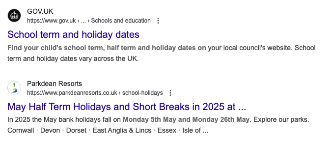
Google is testing a slightly different layout for its search result snippets. Google seems to be indenting the title link, URL and description to the right and placing the favicon indented to the left of that placement.
This is a subtle change but Google has been testing it over the past few days.
I first spotted this via Damien who posted a screenshot on X - here is a side-by-side, so you can see the difference between the two. The test version is on the left:

Then Will O'Hara also spotted it and shared some screenshots on X as well:
vs

Here are more:
@rustybrick seems like a test today its showing up for me too. pic.twitter.com/3SvQOkcMJ6
— Gagan Ghotra (@gaganghotra_) May 4, 2025
And Frank Standtman also posted about this on Mastodon.
I am not sure how much it matters or not but hey, I like tracking these changes: