Google has overhauled the design of Google+ with a fresh new redesign that they introduced yesterday.
The new design includes:
- Side bar that can be customized
- Full bleed photos are now in the timeline
- The discussion stream is now in the format of conversation "cards" enabling you to see a conversation better
- Each of these cards has an "activity drawer" to show what is going on with the conversation
- Hangouts has a landing page with more details
Pretty much everyone I know already has been upgraded to the new design. Here is a picture from Google:
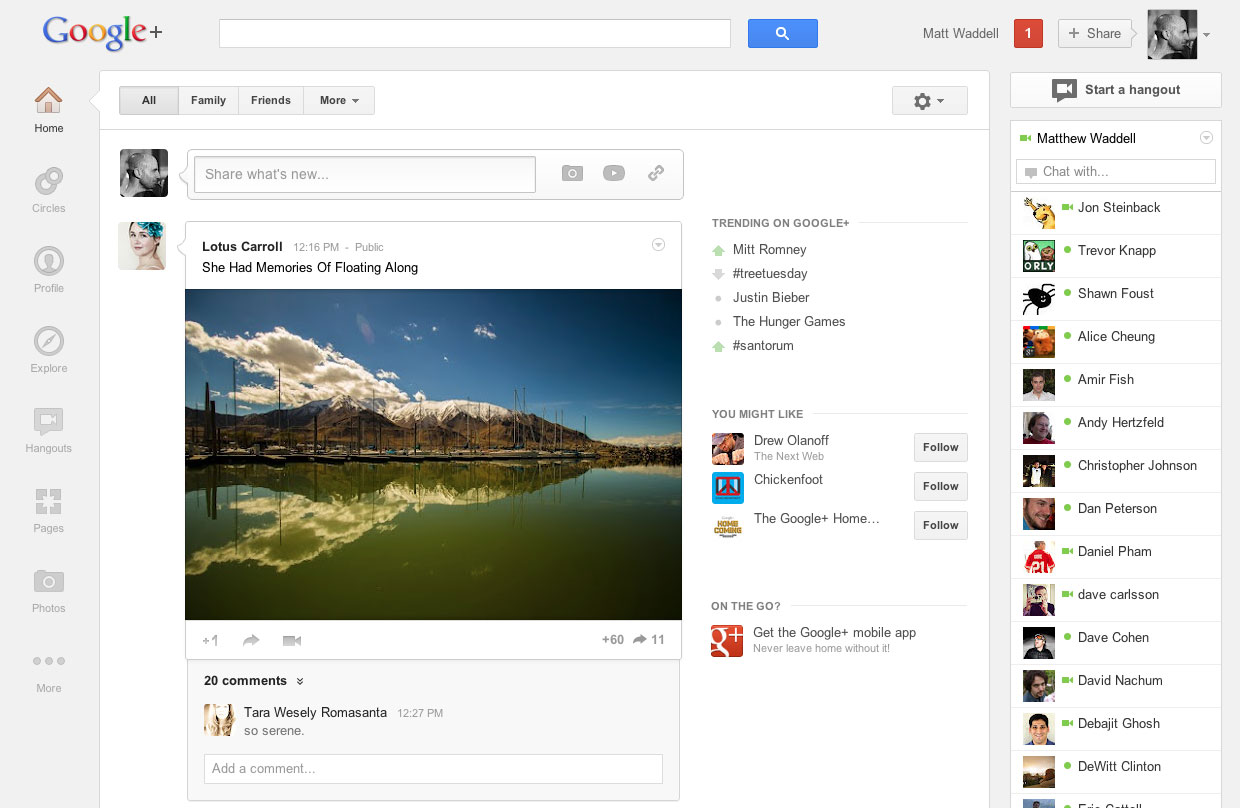
What I see is different in that it looks more like this:

Yea, the biggest complaint or discussion point is all that white space between the conversation stream and the right side bar.
There are tons of stories on it, see those stories at Techmeme.
Forum discussion at Google+ Help and WebmasterWorld.