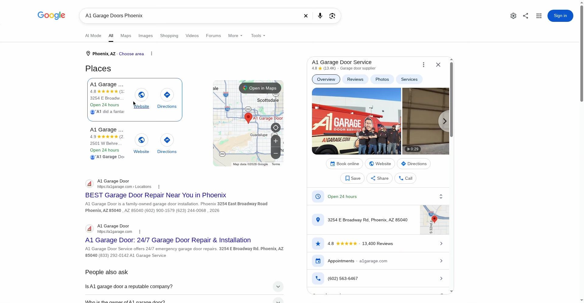
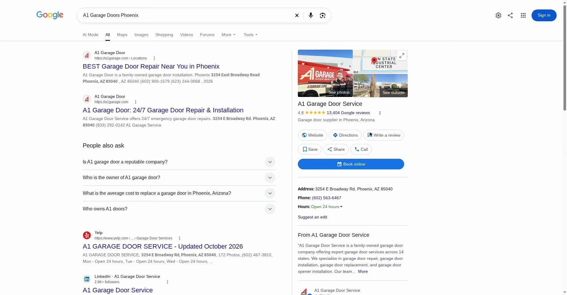
Google is testing moving things around in the local knowledge panels in Search by swapping the position of the company name, ratings, description and action button with the business photos. It is a subtle change and it matches the current mobile design on Google Search more but it is a change.
Below that, the bottom part is tightened up on the new design.
This was spotted by Ben Fisher who posted screenshots of this on LinkedIn. I tried for a day to replicate and I cannot.
Here is the new design/layout for these local knowledge panels in Google Search:
Here is the old/current version:
I asked ChatGPT to illustrate the changes more visually so you can see it and it did a pretty good job:
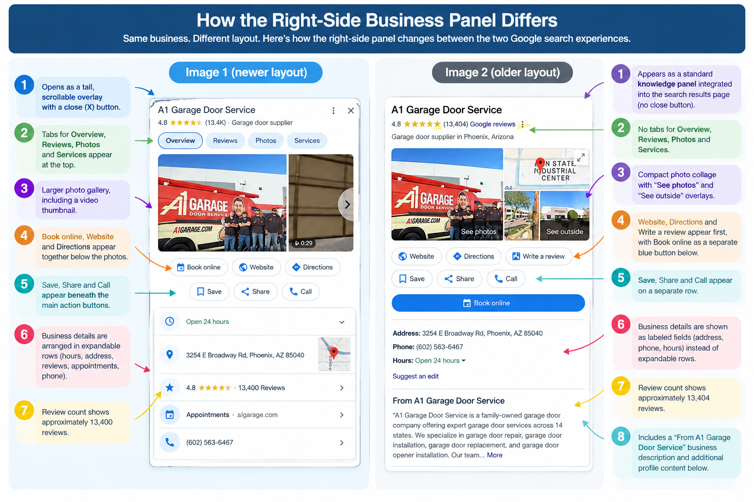
It is super possible that this new layout goes live in the near future. And how will this new design impact clicks, calls, directions to those businesses?
Forum discussion at LinkedIn.