
Google seems to be rolling out a new format for some of the AI Overviews it shows within search. This format shows a drop-down, expandable, accordion-style interface that you can expand to show more.
The issue is, it just seems like there is a lot of wasted white space and things are just not lined up properly.
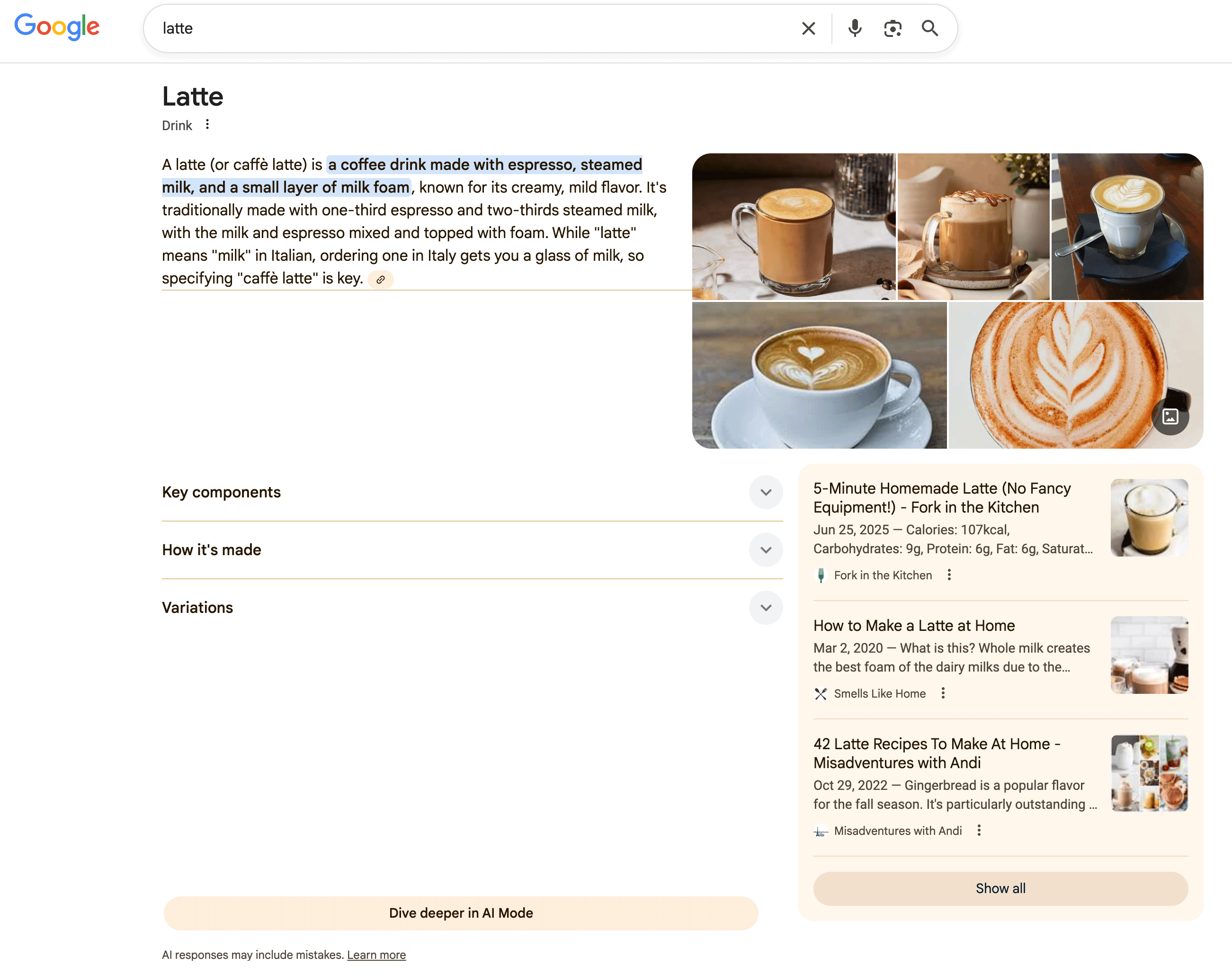
This was spotted by Shameem Adhikarath who posted some examples on X - I am able to replicate it, so here is what it looks like when you show the AI Overview:
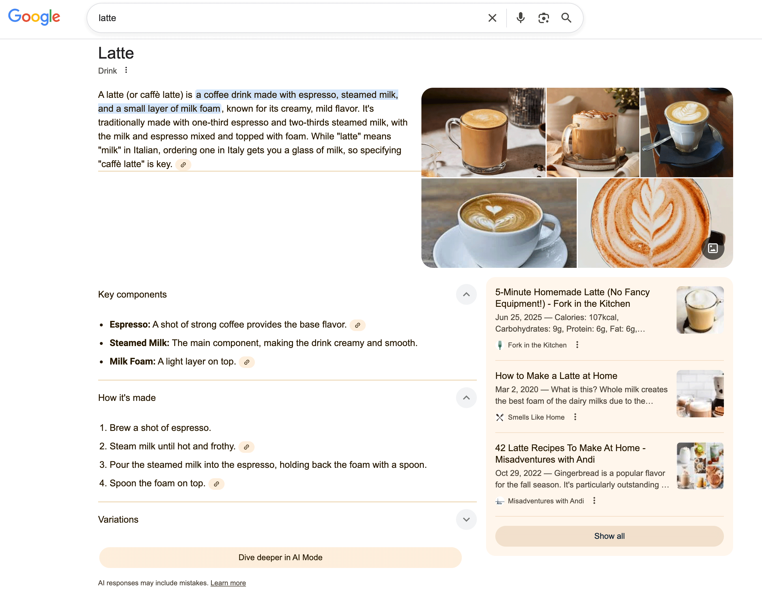
Then when you click on some:
Here are more screenshots and videos:
Drop-down section within AI Overviews. cc: @rustybrick pic.twitter.com/HHRlyyokXb
— Shameem Adhikarath (@shemiadhikarath) March 2, 2026
It just looks off...
Forum discussion at X.