Starting a few days ago, it appears Google Analytics changed the behavior of the display graph based on your date selection criteria. In the past, if you selected a specific date criteria that was less than 30 days, Google would fade out the remainder of the days and highlight the dates you selected. Now, it looks like Google only shows the dates you selected.
This is a small but very significant change. I personally prefer seeing the whole 30 days on the graph, with Google highlighting that they are only using the days I selected. But not everyone agrees with me on that and Google has changed it to totally remove the unselected days from the graph.
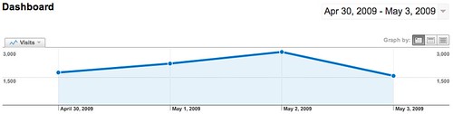
The picture below shows a few days of traffic from my personal blog. In the past, it would show the full 30 days, and just bold those days I selected, now it just shows those days and hides the rest:
Do you like the new way Google Analytics handles this? Take our anonymous poll:
Forum discussion at Google Analytics Help.