Google has been testing a new top bar navigation for over a month now, some would say even longer. But it does appear that new top bar navigation is being rolled out to everyone now. Heck, I even see it.
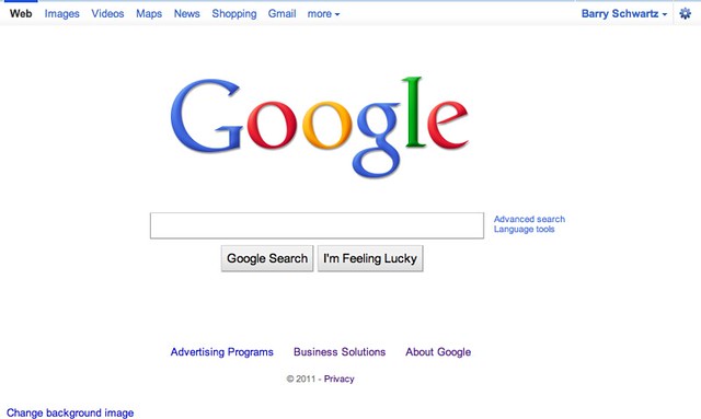
Here is a picture of the new top bar navigation on the Google search home page:
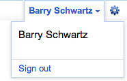
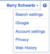
Here is a closer look at the top right section:
I also see it on my Gmail screen, Google Images, and Google Maps. But I do not see the new top bar when navigating Google Video, Google News, Google Shopping, Google Calendar, Google Docs, Google Reader or Picasa.
Forum discussion at Google Web Search Help and Google Blogoscoped Forums.


Comments:
jimrudnick
02/17/2011 02:34 pm
@Barry....yup got to google.ca this am...and it's as noted above, not appearing on all google screens yet... :-) Jim
Bruce Rick
02/17/2011 02:35 pm
I also don't notice it on the Google Accounts page. I'm very surprised they didn't do that one right.
Bruce Rick
02/17/2011 02:36 pm
I was surprised to see that it wasn't on the Google Accounts page as well.
Luke Jones
02/18/2011 12:05 am
It looks much nicer.
Jim Karakas
02/18/2011 04:22 pm
Hate it
Michael Martinez
02/18/2011 04:32 pm
I have only one word to say about it: ICK.
Dave M
02/19/2011 12:12 pm
It looks a little "Chome-itized", but I like they have removed my email address from plain sight.
4newbusiness
02/23/2011 04:29 am
I don't like it because it startled me & made me think I was being hacked. I feel that they should generate an email to let email subscribers know of changes such as these. This is one of the many things about Google i'm begining not to like.
Husain
02/23/2011 10:35 am
they have aging reverted that change. :-(
fuzmorten
02/25/2011 11:14 pm
they must have a lot of bored programmers. It totally misses in regards to personal security too making the sign out button hidden now, when it was right at the top of the page before especially when Gmail emphasizes the need to log out when you close your browser to properly protect yourself. Please get it together. Why hide the log out button???
mola2alex
03/03/2011 06:44 pm
I personally like the new bar. It is about time they moved a bit past the classic hyperlink look
Fuzmorten
03/04/2011 06:17 pm
Do you only care about how things look or should they function properly... Hiding the sign out button is just plain dumb!
mola2alex
03/04/2011 06:26 pm
I also find it more functional for how I use it. I like to stay logged in, I don't roam on public PC's so signing out isn't a thing I use often. I think a lot of UI was taken up in the top right and now it looks cleaner and I think it is better organized. You are entitled to your opinion but this is a welcome change for me. No longer is my email displayed along with settings, account, help, sign out etc. Now two simple buttons to get at features I don't use day to day.
Frostyfrog
03/11/2011 07:30 pm
Follow their blog with an rss feed reader?
Alwyn
05/28/2011 01:36 pm
Thanks for the tip. I couldn't find how to sign out.
Joe
06/14/2011 11:32 pm
they added the sign out button
Joe
06/14/2011 11:32 pm
they added the sign out button
Mahavirsahay
06/20/2011 06:28 am
How can I sign out?