Google Trends Adds Comparison Over Time Data & Chart

Jul 1, 2026 - 6:13 am 0 by
Filed Under Google

Google Trends Hero

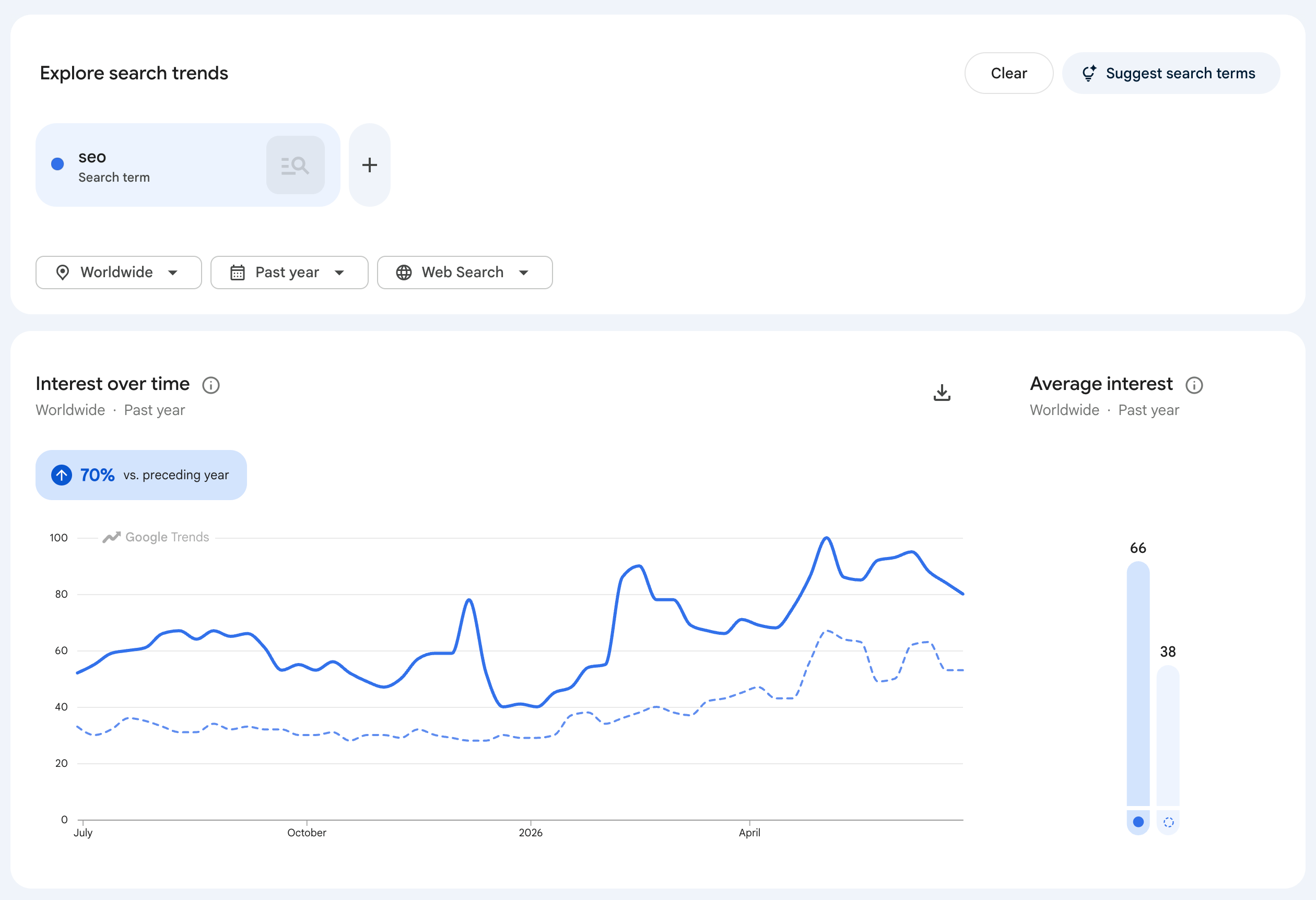
Google Trends now lets you plot the change of interest in keyword phrases over time and then compare those over the previous time. There is a new compare to previous time period button you can click on Google Trends to get the good looking chart to be drawn.

Google announced on LinkedIn, "You can now quickly compare a trend's change against preceding periods directly within Google Trends."

Here is what it looks like:

Google Trends Time Comparison Chart

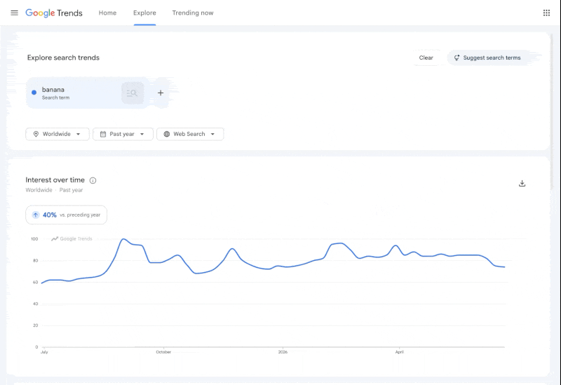
Here is a GIF of it in action:

Google Trends Time Comparison Chart

How does it work? Google wrote:

Simply add a search term or topic to see new chips above your timeline. These chips show percentage changes for various periods—whether you're looking at Month-over-Month, Week-over-Week, or even specific Year-over-Year benchmarks. A single click overlays the historical comparison line onto your graph for instant visual context.

Forum discussion at LinkedIn.


Popular Categories

The Pulse of the search community

Google Search Volatility

More Details

Search Video Recaps

 
Video Details More Videos Subscribe to Videos

Most Recent Articles

Search Forum Recap

Daily Search Forum Recap: July 3, 2026

Jul 3, 2026 - 10:00 am
Google Search Engine Optimization

Google Page Indexing Report Has Been Fixed & Updated

Jul 3, 2026 - 8:20 am
Search Video Recaps

Search News Buzz Video Recap: Google June Spam Update Done, Fraud DMCA Takedowns Breaks Google, Costly Google Ad Budget Changes & More

Jul 3, 2026 - 8:01 am
Google Maps

Google Local Reviews Go Missing For Many Businesses

Jul 3, 2026 - 7:51 am
Google Maps

Google Business Profile Restrictions & Penalties Are Additive

Jul 3, 2026 - 7:41 am
Google Maps

Google Tests New Local Places Layout Design

Jul 3, 2026 - 7:31 am
 
Previous Story: Fabrice Canel Retires From Microsoft After Almost 30 Years Of Service