
Google is rolling out a new look and feel for the Google Ads campaign status notifications and icons. The new statuses are no longer highlighted fully, instead they are just outlined in various colors. It makes it a bit less extreme to look at, and I am not sure if that is a good or bad change.
This change was spotted by Saquib Syed who wrote on LinkedIn, "Google has quietly rolled out a design refresh for campaign statuses, shifting toward a much cleaner and more minimalist interface."
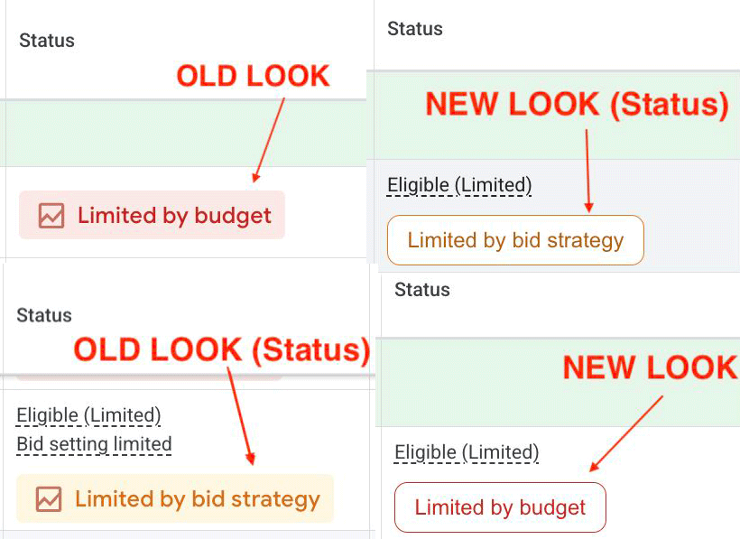
Here are screenshots of the new and old look:
Saquib wrote:
- The Old UI: Statuses used a prominent, fully color-coded badge with a solid background fill.
- The New UI: The solid background fill is gone. It has been replaced by a streamlined, transparent badge that features only a clean, coloured outline around the status text.
Forum discussion at LinkedIn.