Google Docs Launches New Interface
A Google Groups thread announces a new interface for Google Docs which happens to be miles better than the older interface. The Google Docs and Spreadsheets blog also covers the launch and redesign.
What has changed?
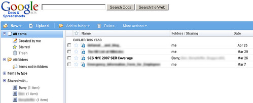
- There's a great new appearance.
- There are now folders for easy organization.
- The search function has improved.
- The interface now lets you view documents based on chronology, so you can see documents edited "today," "yesterday," "earlier this month," or "earlier this year."
- You can also sort by collaborator in shared documents.
Here's a screenshot of the new look of Google Docs:
This interface is much improved over the old one. Great job, guys.
Forum discussion at Google Groups.
Like The Story? Vote For It On Yahoo Buzz! Or On Sphinn!
Tamar Weinberg in Other Google Topics at June 27, 2007 9:17 AM
Comments (1)


Comments
miles better? hardly. it's somewhat a step backwards. They bastardized the beautiful simplicity of tags by switching over to the outmoded "folders" metaphor. And i used to be able to run a very skinny "sidebar" browser for my docs home, with the rest of the monitor dedicated to the open document in a separate browser window. Now that functionality is not possible, as this new interface can only be about as skinny as one half the width of the screen. Furthermore, what's with the widths? I can't adjust the built in sidebar to display full width, and it displays something by default i care very little about - all of my shared doc collaborators in a stupid unordered list. Lame.
Having said that, it does look better. Yet looks do not matter nearly as much as functionality, so the net result of this overall is, in my humble opinion, a giant step backward. :(
Posted by todd at June 30, 2007 19:57