Yesterday, Search Engine Watch and the blog and forums, underwent a redesign and had features added. There is a Search Engine Watch Forums thread now discussing the changes. I thought I do a before and after comparison.
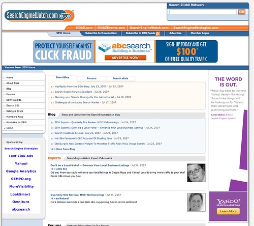
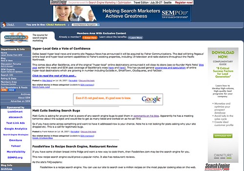
The Home Page
Before:

After:
A Search Day Article
Before:

After:

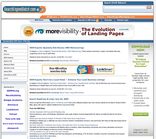
The Blog
Before:
After:
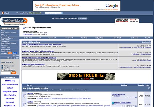
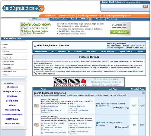
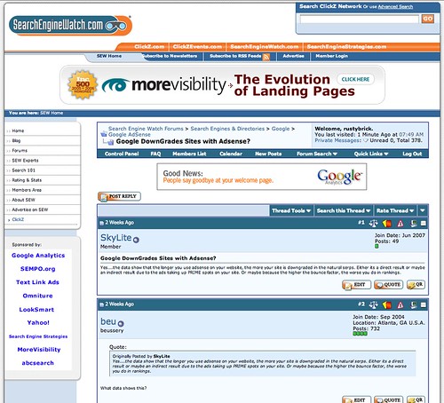
The Forum Home
Before:
After:
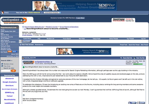
Forum Post View
Before:
After:
Those are the side by side comparisons.
Personally, the new look is a lot more "airy" due to the white new look. The homepage has this new AJAX tabbed approach to see content from SearchDay, Forums or the blog. The forum upgrade added the latest VBulletin features, which is nice - especially the quick reply. My only issue is the smaller fonts used throughout the site, and even more so on the forum thread titles within the thread views of the forum.
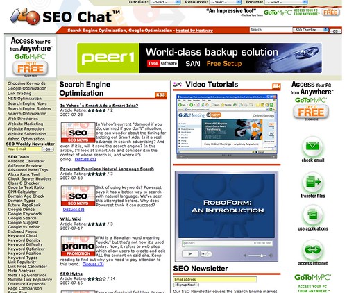
One other thing is that this new design reminds me a little of SEO Chat:
Overall, the feedback in the forum on the new design is positive. It will take a bit getting used to, but that will happen over time.
Forum discussion at Search Engine Watch Forums.
